by marchustvedt on 12/31/13, 8:27 AM with 91 comments
by Someone on 12/31/13, 9:01 AM
It would be more reasonable to show a per-year, per student debt (people graduating in year X had an average debt of $Y; people leaving without graduating had an average debt of $Z)
Such a graph probably still looks bad (median income has dropped, after all), but it will be more informative.
by ForHackernews on 12/31/13, 9:53 AM
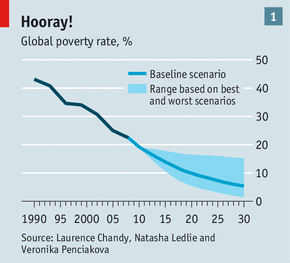
How about this one: http://cdn.static-economist.com/sites/default/files/imagecac...
From this article: http://www.economist.com/news/briefing/21578643-world-has-as...
by w1ntermute on 12/31/13, 9:53 AM
by ntoshev on 12/31/13, 9:00 AM
by pmarca on 12/31/13, 10:19 AM
http://www.bls.gov/emp/ep_chart_001.gif
Summary for the graphically challenged: unemployment in the US is low (<5%) for people with bachelor's degrees and up, and high (>5%) for people with less than a bachelor's degree. Unemployment rises directly in proportion to how little education one has.
by jmathai on 12/31/13, 9:12 AM
So much of our population goes straight from high school to a 4 year college program. That's while they're between the ages of 18 and 22.
Unless you're studying to be a doctor, lawyer, nurse, engineer, etc. then that's 4 years of lost productivity.
I think most professions could be trained for in under a year + on the job training.
Even if the argument is that college is largely social growth for the student it's insanely expensive if we need 4 years to do it.
by pwang on 12/31/13, 10:37 PM
When you use a line graph, visually, you're displaying a trend (in the most naive way possible). When you have two Y axes, then you need to ask, "What is a valid way to compare two trends?" Remember, a trend is intrinsically about slope. If you arbitrarily adjust the min/max axis value, then you can arbitrarily adjust the appearance of the trend.
Here is a fixed version that shows the actual numbers on full, 0-based scales: http://i.imgur.com/xiS2OZq.png
Hopefully this shows you how deceitful Thiel's plot is, even though the axes are "clearly labelled". Iconic perception trumps reading numbers.
Here is a year-over-year plot: http://i.imgur.com/diDVNeE.png
An alternative, more meaningful visualization, would be to show % change from a baseline, in this case the 2003 value. That would be far more honest and informative. And here it is, as a bar plot, which is more effective for comparing values along a common scale. (Since we have computed percent change, we have a common scale.)
http://i.imgur.com/TQd2u22.png
*Note: I just read the numbers off of Thiel's plot and don't have the source data, so this plots are approximations. I can share a simple IPython notebook of this if anyone really cares.
by 001sky on 12/31/13, 9:05 AM
This disconnect between marginal productivity and actual wages for marginal work is evident in other data, eg
http://www.nytimes.com/2013/12/30/opinion/america-in-2013-as...
by guard-of-terra on 12/31/13, 9:45 AM
Why people go into higher ed? Because that's how you keep in the middle class. Why do they want to be in it? Because it's either this or poverty. Why do debt rise? Because they are desperate. Why are they desperate? Because there is less and less jobs in middle class and even worse and worse condition outside. When the music stops most of young people won't have a chair to sit on. At least in the USA.
by JunkDNA on 12/31/13, 2:55 PM
by dpierce9 on 12/31/13, 2:14 PM
Even this suggestion wouldn't be that great. To make a simple apples to apples comparison, we would need the graph of salaries of representative samples of comparable bachelors and non-bachelor holders. I don't really know what 'comparable' means in this context but it might be something like comparing the salaries of kids who graduated from college with kids who didn't go to college but could have (and maybe received comparable on the job training).
One might also think that college affects, for instance, your likelihood of getting a job but we wouldn't want to get too complicated.
by dsundstrom on 12/31/13, 9:21 AM
The implication is that a bachelor's degree is costing more and generates less income, but what the graph shows is "total student loan debt" not the "cost of a bachelor's degree".
Technically this graph could be a good thing if we could graduating significantly more people who make more than someone without a degree (but 10% less someone who earned a degree 5 years ago), since more people would be better off.
Other things to note: The time period is arbitrary and mostly shows the impact of the recession over the past 5 years. The graph shows total student load debt which includes everything from vocational programs to PHD students in public and private institutions. The graph has two independent scales so the slopes are arbitrary.
by ontheinternets on 12/31/13, 2:42 PM
If you compare the entire education investment to the return during year one in the workforce, it isn't going to look good.
If you compare the entire education investment to the impact it has on that person's lifetime, e.g. lower unemployment, easier time getting into grad school if the economy goes sour, easier time retraining, and just general high earnings, then the investment makes a bit more sense. I assume if this were a business, Thiel would wonder why education is underpriced.
by lzhou on 12/31/13, 9:42 AM
Median wages dropped (starting in 2007) because of a recession, and we are still in the adjustment process of that (ex. on the wage side). We notice that post popping of the 2001-2002 bubble, the median wages actually increased into 2007.
I don't have all the facts, but the chart is misleading.
by wch on 12/31/13, 3:53 PM
by bonemachine on 12/31/13, 7:35 PM
by mathattack on 12/31/13, 2:40 PM
The two things I would like to see are:
- Per capita debt per person who attended college. (Or perhaps who graduated college) This would answer an implied question of "What if we're just getting more people going to college?"
- The salary legend should start at 0. This would put the relative movement of salary in a more accurate context.
I don't think fixing these changes the story of "The long term cost of college is going up, while the short term benefits are going down." but when I see tricks out of "How to lie with Statistics"[1] my BS detector goes up.
[1] http://www.amazon.com/How-Lie-Statistics-Darrell-Huff/dp/039...
by gejjaxxita on 12/31/13, 12:48 PM
by kayoone on 12/31/13, 10:38 AM
1) Income scale is not zero based and makes a small change seem enormous
2) Student debt should be per person per year, not a total sum which is influenced by the number of students and numerous other factors.
by safeerm on 1/2/14, 6:02 AM
by ecocentrik on 12/31/13, 10:04 PM
by JeffL on 12/31/13, 9:32 AM
by michaelochurch on 12/31/13, 3:28 PM
Yes, the axes have been chosen in such a way to exaggerate the (still valid) point. This isn't any different from a visual model of the solar system that downplays the (vast) differences between the planets, relative to their sizes. Is it "misleading"? Only if it's presented and interpreted as a scale model. In this graph, the axes are clearly labelled, informing the reader of what's going on.
Thiel is right that there's a problem. The Satanic Trinity (housing, healthcare, tuition) that is killing the middle class is fundamentally extortive at this point, and extortionists are known for rapidly ratcheting up their demands. What's happening is that, as the middle-class breaks down, people are panic-buying the credentials and connections that might keep them alive in this game of musical chairs.
I don't support Thiel's solution (as an aside, he's an investor in Knewton, one of the most pro-establishment ed-techs out there) but he sees the problem with a clarity that few do.