by achairapart on 4/23/24, 9:32 AM with 343 comments
by achairapart on 4/23/24, 12:35 PM
The news here is that people at WebKit decided to push the debate to the public, inviting designers and developers to take some action (“post to social media, write blog posts”), in order to get past this.
While it may look just like a formality, I think this will make an important precedent. The real underling debate here is either to treat every layout option as a part of the CSS Grid, or keeping adding new CSS Display proprieties as necessary.
The first option will make even more complex the (already convulsed, IMHO) CSS Grid specs, the latter will bloat the CSS specs with a load of new proprieties (and related sub-proprieties).
Either way, it's not as easy as it looks.
by chrismorgan on 4/23/24, 11:07 AM
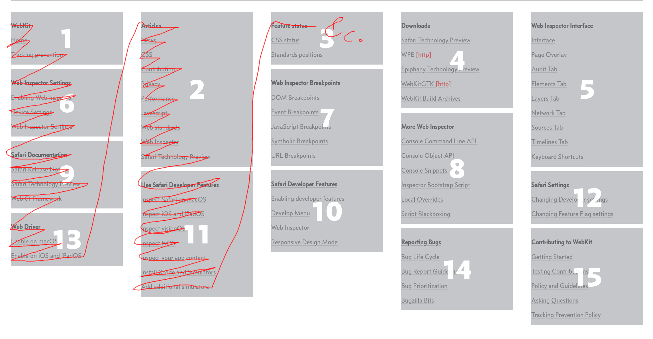
The reading order you’d expect: https://temp.chrismorgan.info/2024-04-23-masonry-megamenu-2.....
What the demo actually gives you: https://temp.chrismorgan.info/2024-04-23-masonry-megamenu-1..... This affects correct reading order and tab indexes. Basically, sighted users will always read things in the “wrong” order. This just drives home that there is no structure, it’s just an unstructured bag of links. Except… actually if you go through them in numbered order, it looks like there was some fairly logical ordering. It’s just been utterly demolished by inappropriate masonisation.
(I’ve turned on “number items” in those screenshots. Normally, it’d look more like normal columns with no backgrounds.)
The way it should be implemented is with columns, but adding `break-inside: avoid` on each section, which their demo has missed.
The newspaper demo is also a little dubious for similar reasons, but it’s a much smaller deal.
Now images and such media which are in more independent blocks and where reading order isn’t such an ingrained thing, masonry layout does work better there. There are still patches where things can be a bit iffy, mostly around tab indexing, but it’s not obviously wrong any more.
by pimterry on 4/23/24, 10:48 AM
In each case it'd look much nicer with a proper masonry layout but it's still very usable otherwise (and of course you could feature detect to provide a better fallback if you're not happy with that anyway).
by t_mann on 4/23/24, 1:48 PM
I just wish there was an alternative to the default masonry ordering, which afaik is a simple rule that goes sth like 'place the next item in whichever column it can go up highest'. This means that the left-to-right order is really juggled from the second row onwards. What I imagine would be really nice is if there was a layout that preserves more of the left-to-right (or right-to-left, if that's your preferred direction) reading flow. Something like 'put the next item one column to the right of the previous item (or in the leftmost, if you were at the rightmost), unless you can put a second item in the same column without the new bottom going too far below the bottom border of the column to its left'. This would be more flexible than strictly going left-to-right (which would also mess up alignment) and would reatin some meaning of the left-to-right reading direction.
I know it won't be possible to accommodate every possible formula one could prefer for masonry, but if you have content where the ordering matters at least a bit (maybe not for Pinterest, but for a journal eg it would), then I really think sth like this would be a more sensible default than the classic masonry rule.
by turboat on 4/23/24, 3:03 PM
Are there any books or papers on how to create a coherent layout system?
What about alternatives like Qt, Tk, SwiftUI, etc.? I've never used anything besides CSS. Are any of the actually-implemented systems in the wild better? If so, what makes them better?
I want a system that provides a better interface for developers, but how? If we could start over, what are the design principles?
by SassyBird on 4/23/24, 3:17 PM
I have a website with my photos, which doesn’t use any JS for layout. When I was making it, I considered using JS masonry libraries, but I wasn’t satisfied with the results. Proper masonry layouts which fill all available space in practice actually crop some images. Leaving space around photos is required when you don’t want cropping and want to preserve aspect ratio. The only way not to do that is to have infinite scroll, which I guess is what corporate addiction machines want, but that’s not what I want on my own website. Here is what I did:
https://yakubin.com/photography/albumless/
https://yakubin.com/photography/album/kenya-2023/
I used display:inline-block to achieve this result, effectively treating photos as text that needs to reflow into new lines. I’m very satisfied with the result and prefer it over what the masonry libraries do.
by emadda on 4/23/24, 12:43 PM
by m3h on 4/23/24, 10:51 AM
by ThatMedicIsASpy on 4/23/24, 11:36 AM
The last image has it turned off.
by pimterry on 4/23/24, 10:58 AM
by iteratethis on 4/24/24, 9:47 AM
Also, I think the need for masonry is vastly overestimated or perhaps not fully researched. It is presented/implied to be a common need but it isn't. Check the top 100 websites, check your personal top 20 websites, how many use masonry? I bet not that many, it's niche use case which also has plenty of usable alternatives. It also never even shows up in any developer surveys.
Anyway, if we're into the game of building very specific layout solutions into CSS itself now, I'd argue the layout as seen on Google Image search is the far more useful one. It is somewhat of a horizontal masonry, but not really. Each image must keep its original aspect ratio (no cropping) whilst all images on the same row have the same height, thus filling the vertical space of the row fully. At the same time, rows must be roughly of the same height. There can be no gaps at the end of a row nor at the last row.
Quite hard to implement, although there's articles describing how.
by paradox460 on 4/23/24, 5:22 PM
When I was cutting my teeth in web design, the early webkit blog and safari releases were always inspirational. The rate at which they pushed out new features in the mid 00s was astonishing
by account42 on 4/23/24, 4:01 PM
by lovegrenoble on 4/23/24, 11:27 AM
with flexbox - I use this tool to streamline the process: https://flexboxcss.com
by branmcconnell on 4/23/24, 6:20 PM
After reading through the article, I’m convinced it is the right path forward, allowing masonry layouts to utilize the same APIs and properties (columns/rows, gap, etc.) as CSS Grid.
This would lower the bar of entry by using familiar APIs and allow simpler switching between masonry and other column/row setups responsively.
```css .example { display: grid; grid-template-columns: repeat(auto-fit, minmax(250px, 1fr)); grid-template-rows: auto; @media (width > 500px) { grid-template-rows: masonry; } } ```
by pquki4 on 4/23/24, 11:24 AM
by specialist on 4/23/24, 3:26 PM
Out of curiousity, why don't browsers have pluggable layout managers? Like Java's AWT/Swing LayoutManager. [1]
Fussing with CSS and Java's stock layout managers (gridbag, table) always fills me with frustration and anxiety. In my experience, for the fussy work, it's easier to explicitly code what I want.
Ages ago, inspired by Designing Visual Interfaces [2], I made a layout manager [3] for canonical design grids [4].
It was pretty neat. Fluent API. Always visually correct. All the baselines aligned just so. Predictable results. Perfect for banging out CRUD forms. [5]
1/ https://docs.oracle.com/en/java/javase/21/docs/api/java.desk...
2/ https://www.amazon.com/Designing-Visual-Interfaces-Communica...
3/ https://web.archive.org/web/20110302212909/http://java.net/p...
4/ https://web.archive.org/web/20110308034949/http://designgrid...
5/ https://web.archive.org/web/20110515182322/http://wiki.java....
by roblh on 4/23/24, 5:55 PM
Edit: reading further, I think my approach was basically the same as theirs near the end of the post!
by codingclaws on 4/23/24, 11:39 AM
by slimebot80 on 4/23/24, 12:20 PM
Like: Given these images, and this window size, here's a calculated layout to make them all look nice...
I figure this would be more performant than any type of JS polyfill
by jmull on 4/23/24, 6:25 PM
by hgyjnbdet on 4/23/24, 9:53 PM
To my mind flexbox could be a basis for masonry way better than grid with less overhead.
I also think mosaic would be a better name.
by paulhilbert on 4/23/24, 1:34 PM
Would it instead be possible to exclude anyone with that attitude from a discussion about an open standard? I know this sounds toxic, but I would argue that approaching public design this way is ultimately more toxic wrt the outcome and those affected by it.
Or maybe I misunderstood that part since everyone seems to not be bothered by it at all here...
by _akhe on 4/23/24, 6:49 PM
But after seeing this I should switch to using CSS. Didn't put too much thought into it, but when I realized it wasn't immediately simple in CSS grid just did it in JS.
by fzeindl on 4/23/24, 6:01 PM
It is simple, intuitive, it works for all cases. Instead we are inventing, what, the fifth generation of CSS-layouting now? Does nobody think this is odd?
by KwanEsq on 4/23/24, 12:16 PM
by thebeardisred on 4/23/24, 4:46 PM
by ivanjermakov on 4/24/24, 10:43 PM
Masonry layout doesn't form a grid, but multiple columns with a variable item height.
I feel like this should not be a part of CSS spec, and absolutely not a part of CSS Grid.
by mg on 4/23/24, 10:49 AM
by thih9 on 4/23/24, 8:26 PM
by danjl on 4/23/24, 6:29 PM
by nsonha on 4/23/24, 10:55 PM
by Onavo on 4/23/24, 2:52 PM
by tomp on 4/23/24, 12:41 PM
by Unai on 4/23/24, 2:09 PM
But I think, and I hope, that people aren't the fools she's taking us for, and can see how absurd her proposition is.
You could basically clone the grid specification, if you want all those features, and that way both can be developed with what works for each. She says doing that means new grid features might take more time to come to masonry. Really? More time than having to deal with new grid features that won't work at all with your version of masonry integrated in grid? You're still having to deal with two layout systems, even if you want to disguise one of them. Except doing it your way you can't select which system gets the features that work with it.
At the end, instead of two layout systems with two complete sets of features, we'll have one single layout system with a bunch of features that sometimes work and sometimes doesn't, depending on a particular value of a particular declaration that you'll have to know about. And that's why people hate CSS.
Seems lazy and an absolute mess to maintain. And it doesn't make sense at an intuitive level, since masonry works similarly to flexbox, not grid; and it doesn't make sense at a logical level either, since a masonry layout is not a grid.
But I guess this is what we'll end up getting, since apparently anything Jen says goes. Like the ridiculous idea of doing "CSS4", which means nothing, does nothing and is nothing, but we're going with it for some reason anyway.
by cnotv on 4/23/24, 5:39 PM
by egypturnash on 4/23/24, 2:16 PM
by 6510 on 4/23/24, 12:55 PM
Without that I cant think of an "easy" to implement formula to keep each column the same length.
If given a group of numbers, how would one divide them into 8 groups the same size?
Extra fun: You may increase each number by n in order to make each group exactly the same size. n must be as small as possible.
by luc_ on 4/23/24, 7:50 PM
by nofunsir on 4/23/24, 2:42 PM
by rezonant on 4/23/24, 11:03 AM
OK, having read a lot more, here's my thoughts.
I love the possibilities that can be raised here when masonry is built into grid, but you can target specific rows and columns for specific elements in grid. This is a useful thing for some layouts, but when the rows are truly non-existent (unlike the related auto fill/fit stuff we've had until this point) I feel like the abstraction begins breaking down. As much as I love that we have Apple pushing to get this done, I do think it is probably better to go with a net new masonry display type :-/
by phkahler on 4/23/24, 12:27 PM
It seems like either these constructs are poorly designed, or people don't see how to use them to get what they want.
by mattbessey on 4/23/24, 11:09 AM
I find it amusing that they've decided to refer to this as masonry layout. If you actually built a wall like this (as opposed to uniformly-sized rows, without any columns) it would be a structural engineering disaster.
by pavlov on 4/23/24, 11:16 AM
They’d just created a single program, call it the “Central Software System”, and defined thousands of properties that let you control its state machine to produce the output you need.
Presto! The perfect computer. If for some reason someone needs a new kind of output, it can be added to the Central Software System via a friendly decade-long committee process.
And if the properties happen to conflict in how they define some output, well, the one company in the world who has actually implemented all of this “open standard” can decide what happens in that case.
by aidog on 4/23/24, 3:53 PM
by hwbunny on 4/23/24, 2:45 PM
look at this, how intuitive, how readable:
grid-template-columns: 14ch repeat(auto-fill, minmax(28ch, 1fr)) 14ch;
just throw the whole grid thing out of the window and get on board someone who can create syntax that wouldn't send you to jump off a cliff and feels like it was made by a fellow human being, not an AI controlled robot.
by spintin on 4/23/24, 5:10 PM
Browser developers are now reaching for straws to remain employable.
That said the biggest tasks remains:
- Go back to HTTP/1.1 with "One time password" auth.: https://datatracker.ietf.org/doc/html/rfc2289
- Simplify the browser so that it can be compiled in less than many hours on the latest CPU.
- Completely remove the tie-ins to any commercial/governmental entities.
Basically go back to Netscape with some improvements to javascript performance and hardware accelerated rendering of HTML.
Everything else invented in the last 20 years is meaningless. This is valid in most domains: Raspberry Pi is the only real exception.