from Hacker News

MacOS X 10.1 (2001)

by wastedbrains on 6/14/23, 8:05 AM with 182 comments

  • by haunter on 6/14/23, 10:57 AM

    Here is the John Siracusa review from 2001 https://arstechnica.com/gadgets/2001/10/macosx-10-1/
  • by coreyh14444 on 6/14/23, 1:00 PM

    I was deep into OS explorations in this period. I ran BeOS, Yellow Dog linux on PowerPC, had all flavors of NT, etc.

    My feeling about OS X at this time was that it was the right choice but that it was "too late" and that Apple took too long and the window of opportunity had passed.

    I take that now as startup advice: It isn't too late!

  • by LeanderK on 6/14/23, 10:16 AM

    Wow, unbelievable that it was designed in 2001! It still looks fresh and modern, although maybe a bit too playful so that it appears a bit childish? But only barely.

    It appears to have all the basic functionality expected from a modern operating system, I instantly feel right at home although I've never used it.

    I find the review terrible though, one of the major changes was the user interface, revolutionary I would say. It's way more important than wether the GUI configuration options are well thought out or not.

  • by selimnairb on 6/14/23, 1:19 PM

    I'll take Puma's System Preferences, pinstripes and all, over what we have today. Blech!
  • by ChrisMarshallNY on 6/14/23, 2:15 PM

    This was Tog's critique, at about the same time: https://www.asktog.com/columns/044top10docksucks.html
  • by weevil on 6/14/23, 11:59 AM

    I have such strong nostalgia and latent excitement about the early days of OS X. I was just a teenager in the early 2000s, and as a young Apple nerd with several iMac G3s in the house (my parents are graphic designers; there was a family Mac, and some cast-offs from my high school) I'd get so into upgrading them through the versions and looking at all the cool new stuff and thinking it was so damn clean and futuristic.
  • by lvl102 on 6/14/23, 11:22 AM

    The first time I learned about OS X, I blindly bought Apple shares. I knew it would set them up for success down the road. Sounds silly now but foundation, such as OS for a computer company, matter.

    Although, OS X was painful for many years.

  • by davidy123 on 6/14/23, 11:02 AM

    They glossed over the NeXT roots which is telling, the ideas were only half-heartedly baked into the OS. It should be strictly enforced that everything on-screen has a relationship to everything else. But that would have been hard work, and they realized eye candy was an easier route when you can just announce something else every few years. This is why desktop evironments really haven't changed since the first commercial releases and Apple is just another PC vendor. Too bad because imagine if the relationship based operating environment was well developed for their spatial headset.
  • by OnlyMortal on 6/14/23, 12:35 PM

    Having developed for OSX in that era, IBM ViaVoice, it wasn’t a completely functional OS. The audio input was broken every alternate build, for instance.

    I’d come from a NeXT background and was surprised how slow OSX (OpenStep in essence) was on PPC.

  • by graypegg on 6/14/23, 1:31 PM

    I think one of the weirdest things to me is how unchanged OSX / MacOS is. As much as I like this specific paradigm of computing UI, I kind of see why they’ve been trying new things as of late. (Stage manager, new settings panel, iOS-y control centre)

    Just because it’s old, doesn’t mean it NEEDS to change, but I can imagine the need to at least explore a bit if something stays mostly the same for 20 years.

  • by classified on 6/14/23, 12:53 PM

    I miss that metal waste basket and the web link "@" spring. And some of the Dock animations.
  • by perihelions on 6/14/23, 11:43 AM

    Here's that mozilla.org/start page from 2001 if anyone was curious how it continues,

    https://web.archive.org/web/20011017155749/http://www.mozill...

  • by Chanderton on 6/15/23, 2:49 PM

    I remember how insanely quick the GUI on the first MacOS X Server (1.0) version was. It was mostly (simple explanation) a classic MacOS theme slapped on NeXTStep with some additional things added (and stripped). Then when the consumer version was released, it looked like a ”Hollywood OS” or a fancy Kaleidoscope scheme (3r party themes for classic MacOS). But it was slow as…

    So the transition for me took a while at the start. Think it was Jaguar, or maybe Panther when i moved 100% to MacOS X.

  • by freedomben on 6/14/23, 1:13 PM

    > This screen shot shows the login screen. It displays a graphical list of users that can login on this system. (Interestingly Windows XP does something similar)

    > Being based on BSD Unix, MacOS X inherits many useful unix features such as real security and user accounts.

    > This means that, for example, you can create a special account for someone else to play games and don't have to worry about them deleting system files, accessing your personal files, or changing system setting.

    > This can be somewhat confusing to users who are used to having complete control over their systems in earlier versions of MacOS. To do things like install software you must be logged in as the Administrator. While this can be annoying it prevents users from accidentally messing up their system or from malicious programs or viruses that could otherwise infect the system. There is also a hidden "root" account that has slightly more privileges than the Administrator, but this is rarely needed.

    Reading this now in 2023 it seems laughably primitive, but I remember the mass confusion at the time! Very similar thing happened with Vista. When old people like me pine for the simpler days of yore, it's hard to imagine just how much simpler those times were (mostly in a good way!)

    I love modern Linux and use it on my family PC and it's great having full multi-user tooling for my kids to have their own spaces with no root, but I do fondly remember the days before user accounts were a thing on your PC. Not to mention how open and interopable things were. Those days don't come back

  • by mmphosis on 6/14/23, 5:01 PM

    Each window has Close, Minimize and Maximize button on it. The "X", "-", and "+" symbols only appear when the mouse moves over these buttons.

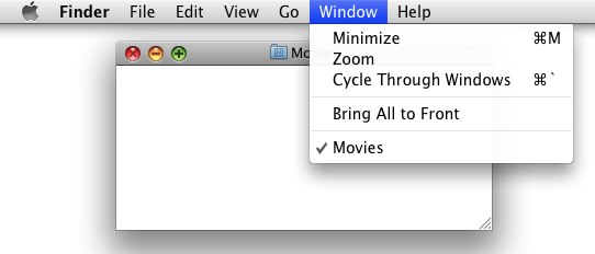
    The "+" symbol is Zoom, not Maximize. https://iili.io/H6a1uAG.png

  • by b33j0r on 6/14/23, 4:23 PM

    So, I’ve got to ask the practical question. For you early-adopters, is it stable enough to upgrade to, yet? :p
  • by simongray on 6/14/23, 10:59 AM

    > Also folders can be browsed as a series of menus when placed in the dock. http://toastytech.com/guis/osxhddoc.jpg

    That is more useful than the icon view it has now.

  • by racl101 on 6/14/23, 1:24 PM

    Still one of the best looking OSes of all time.
  • by jeroenhd on 6/14/23, 10:25 AM

    Having never actually interacted with a mac from that era, are the grey and white stripes in the toolbar screenshots actually visible on the screen or are they an artifact of old screenshots on modern displays?
  • by tobiasbischoff on 6/14/23, 5:22 PM

    Yeah, I remember that a fried installed a very early pre-version on his powerbook and we where all blown away.
  • by jraph on 6/14/23, 11:46 AM

    Notice the Internet Explorer icon?

    This may feel unexpected and out of place but Safari was first released only in 2003.

  • by threeio on 6/14/23, 4:06 PM

    I miss my candy coated unix as I used to lovingly refer to 10.1 on my iBook back in the day.
  • by I_am_tiberius on 6/14/23, 2:46 PM

    I wish the would modernize the Dock.