by dector on 2/23/20, 8:01 PM with 57 comments
by hlieberman on 2/23/20, 11:42 PM
by ginko on 2/24/20, 9:38 AM
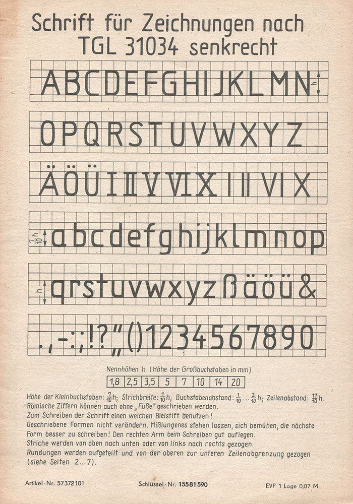
https://de.wikipedia.org/wiki/Normschrift
https://www.typografie.info/3/uploads/99b804cee64ef8c64ad900...
I had to learn that one in drafting class in middle school.
by exmadscientist on 2/23/20, 9:18 PM
Trivial factoid: my understanding is that the Gorton pantograph fonts came first, and that the Leroy lettering sets were manufactured using the Gorton fonts. But I don't have a good source for that, so I could be completely wrong.
by jccalhoun on 2/24/20, 12:38 PM
This font was also used by EC Comics (their comics included Tales From the Crypt). Here is another font based on that which is more fuzzy: https://caseyburns.com/artwork/font-design/
by _jal on 2/23/20, 9:38 PM
by etaioinshrdlu on 2/23/20, 10:25 PM
I too find the high concentration of upper case fonts, especially Courier New, in engineering and especially EE, to be kind of relaxing and pretty.
by qwerty456127 on 2/23/20, 9:32 PM
by gelo on 2/24/20, 9:07 AM
by reaperducer on 2/23/20, 11:20 PM
The closest guesses I can come up with is the Commodore 64 Programmers Reference Guide, or maybe an old terminal or computer magazine. But I could easily be wrong.
Either way, I love it.
by chewxy on 2/23/20, 11:43 PM
by Dramatize on 2/23/20, 9:16 PM
by uasm on 2/24/20, 6:42 AM
How does this work from a copyright/legal perspective?
by sgt on 2/24/20, 2:39 PM
by Waterluvian on 2/24/20, 12:30 AM
by kccqzy on 2/23/20, 10:47 PM
by masswerk on 2/24/20, 12:03 AM
by Gracana on 2/24/20, 4:24 AM
by dim13 on 2/24/20, 11:46 AM
by cellular on 2/24/20, 2:54 AM
by microcolonel on 2/23/20, 10:25 PM