by devins on 3/8/18, 2:34 PM with 80 comments
by et-al on 3/8/18, 11:31 PM
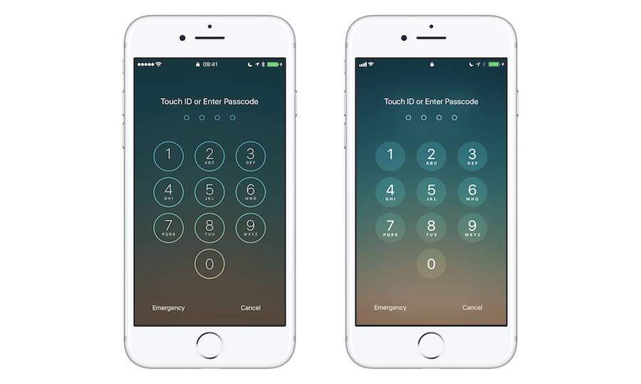
Apple had a good balance between skeuomorphism and minimalism a few years ago, but as Jony Ive & Co. strip out decoration for flatness, iOS 11 almost looks unfinished. Case in point: the PIN screen and the calculator app.
Lock screen: https://file.mockplus.com/image/2017/10/5627bfee-8dbf-44b4-9...
Calculator: http://cdn.iphonehacks.com/wp-content/uploads/2017/06/iOS-10...
I live in an old Victorian house, and there's something very "human" and comforting about the tiny details that designers embark on a crusade to erase every other decade. Sometimes I wonder if flat UI and "brutalist design" [0] came about simply because folks got lazy and need to show something quickly Monday morning.
by jbob2000 on 3/9/18, 2:09 AM
There's no such thing as skeuomorphism for a chat app or a social media site - there's no analog comparison to take design cues from, they're inherently a digital thing. So what you end up doing is wrapping digital things in leather and wood texture as if it was some kind of physical device. It's tacky and cheap, and frankly, I think only a small subset of users get a kick out of it.
I don't like these designs at all. Sure, they are well put together. But the screen feels crowded and the buttons look hard to hit. It just looks incredibly delicate, if i flipped on large text mode, the whole design would break.
On the other hand... Skeuomorphism is fantastic for video games, where utility is not the primary motivator of design. If I'm playing a WW2 game of some kind, yeah, I'm cool with menus looking like war-torn clipboards and whatnot.
by currywurst on 3/9/18, 12:53 AM
The article give iOS 7 the credit for ushering in the 'flat' design trends ... But I remember the Windows Phone 7-8 'Metro' (later renamed to Modern) design language as the key influence. It blew away people with the attention to typography and proportional grid-based layouts.
by c8d3f7b49897918 on 3/9/18, 12:38 AM
I'm glad to see the flat-ui/material-design over-application of minimalism is coming to an end and designers are getting back to more complex visual treatments. My hope is that, rather than casting back and forth between the various schools of thought, designers start thinking in context-sensitive terms: not "Should I use flat design or skeumorphic design for this app?" but rather "Where in this UI are flat design AND skeumorphic designs best utilized?"
by userbinator on 3/9/18, 2:34 AM
by rbosinger on 3/9/18, 12:41 AM
I figured everything would go flat and then designers would bring back skeuomorphic designs and they would pop extra hard in contrast.
Now I bet we'll go really loud and retro ("Stranger Things") for a while until we get worn out and need to take a break and go flat again for a while.
by RachelF on 3/9/18, 12:49 AM
It seems like UI designers are just as fashion concious as clothes fashion designers, and also have less concern for the comfort/usability of their product.
[1]
by bitL on 3/9/18, 1:17 AM
What I am worried though is that "flat" already caused too much damage and we will never see a beautiful complex yet holistic UI again. Something like what happened to IndyCars; they had arguably the most beautiful cars on the planet in 00s, then switched to unbelievably ugly decade and half, and this year will have something that while prettier than what they had before, still can't match their golden age in looks when many people were watching them because they just looked so cool.
by Uhhrrr on 3/9/18, 1:55 AM
by gfosco on 3/8/18, 9:50 PM
by mdip on 3/9/18, 1:58 AM
I'll be the first to admit that "you don't want me doing your UX design"[0], but I found the whole violent shift from skeuomorphic to flat to be too much. Almost over night we went from nearly cartoonish to IRS forms "with color". As a non-designer, I was happy -- finally, I could hit up a web site for a reasonable color palette, grab a popular font from Google and have a design that almost passed as typical. As a user, I found the look ... boring and uninspired.
Here's the thing, though, skeuomorphic design did serve a purpose. It was to equate, for non-tech-savvy folks, concepts from the "real world" to concepts in an app. A few simple design elements can differentiate my calendar from my task list from my playlist and can be highly effective in circumstances where providing a UI more than a very brief glance can be dangerous[1]. And outside of those scenarios, it's nice reducing the cognitive load required to recognize the context of what I'm doing. Unfortunately, it was taken way too far. But it went too far the other way, too. There's a happy medium here, and I rather like the UI presented here as that happy place.
[0] I'm not completely miserable at it, but I'm a developer. I want a knob/switch/setting for everything and the ability to customize everything (I joke that I never quit Firefox because I love "about:config"). My mom doesn't. For most of my projects, which are either personal or targeted at engineers, a lot of time isn't spent thinking about design.
[1] For instance, waking my phone while driving to change the song -- It's nice to see something that indicates "that's a playlist" which is obvious and instant.
by stephencoyner on 3/9/18, 2:00 AM
I love how Google is updating material design to have more aggressive shadows and bring in elements that make the UI feel more like the real world, while also pushing the boundaries of app design with newer interaction models that most haven't seen, but immediately feel used to.
Mobile app design is such a new field, let's not jump back into our time machine because we feel nostalgic for Steve Job's Apple. Let's keep pushing the field forward.
by AstralStorm on 3/9/18, 2:01 PM
That button? Does not really depress and definitely does not act immediately.
Knob you're turning? It is not analogue nor you can really use a true turning gesture.
And why do you have to use one when you have a touch screen to draw the result on?
Computer desktop is not a desk top, items do not obstruct each other.
A file folder has no pages.
Ebook only has them because someone thought it needs to. I'd welcome infinite scrolling in these.
Non-flat is not the same as skeuomorphic. Hopefully.
by nnq on 3/9/18, 7:09 AM
Thing with skeumorphic design is that people really don't know where to stop when they start doing it... so it will be a cycles thing: at some point all cargo-cult designers overdo it, everyone gets sick of it, and we're back to Metro. To be hones though, I like the "improved flat" phase of Material Design and I hope we stay on it as much as possible, so we can focus on things like UX more instead. Back in the days of full-skeumorphic fever, "good UX" was seen as worthless ammateurish crap unless dressed in tons of graphic desinger makeup...
by woodandsteel on 3/10/18, 3:24 AM
Flat design the latest example of a utopianistic drive that started in the 20th century by some intellectuals to make a world that fits robots, not human beings. Other examples are modern classical music and modern architecture. Modern classical music never caught on because it simply doesn't fit the human auditory system. Ditto modern architecture,though it has persisted partly for business reasons, and has been greatly modified to make it more humane.
by majewsky on 3/9/18, 9:44 AM
> make UI fun again
Hell no. I'm not using an app to have fun with the UI, I'm using an app to complete some sort of task [1]. Sure, the UI designer wants to have some fun (same for the developer), but in the end, the user's experience matters the most.
When designers embrace this back-to-skeuomorphism trend, I'd like to remind them of Dieter Rams' Good Design Principles:
> 5. Good design is unobstrusive.
> 6. Good design is honest.
> 7. Good design is long-lasting.
> 10. Good design is as little design as possible.
[1] Implying that it's some sort of productivity app, rather than some game or entertainment content.
by martin_drapeau on 3/9/18, 12:32 AM
Notice there are no textures. Maybe textures was the corny side of skeuo and what people didn’t like.
by guelo on 3/9/18, 2:15 AM
One of the benefits of a platform design language is that users learn the language, they know what the buttons are, how to navigate around without putting too much thought into it. If you deviate from that you really need to be sure the user will benefit from it and it's not just pretty for pretty's sake.
by nategri on 3/9/18, 12:01 AM
by tomc1985 on 3/9/18, 12:54 AM
by zer00eyz on 3/9/18, 12:41 AM
Lets take something that most on here probably remember, the floppy disk. It is still a common sight as a save icon, but my youngest children have never USED a floppy.
I don't mind the concept, as long as the concept isn't sacrificing functionality, and astethics for the sake of nostalgia.
by jgalt212 on 3/9/18, 3:24 PM
https://en.wikipedia.org/wiki/Principle_of_least_astonishmen...
http://www.catb.org/esr/writings/taoup/html/ch01s06.html#id2...